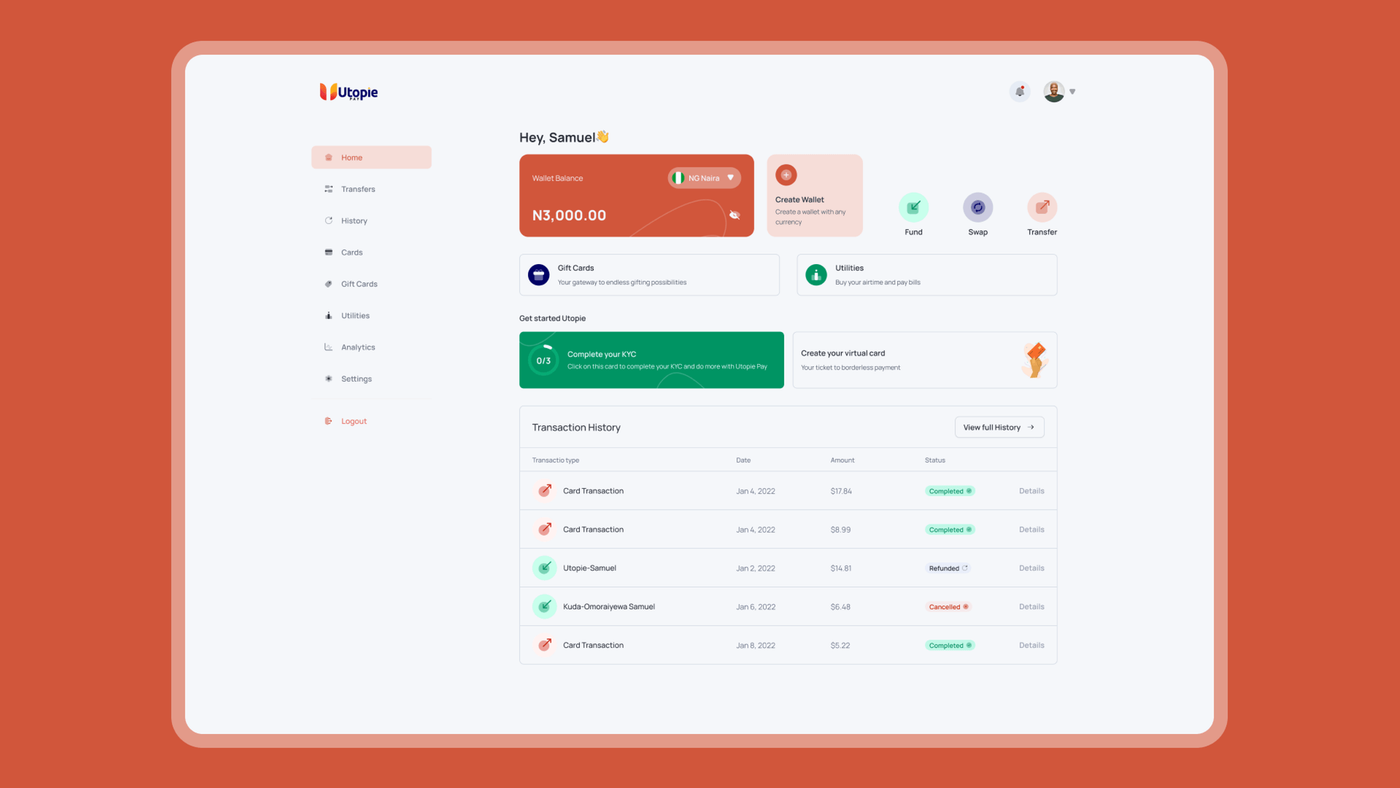
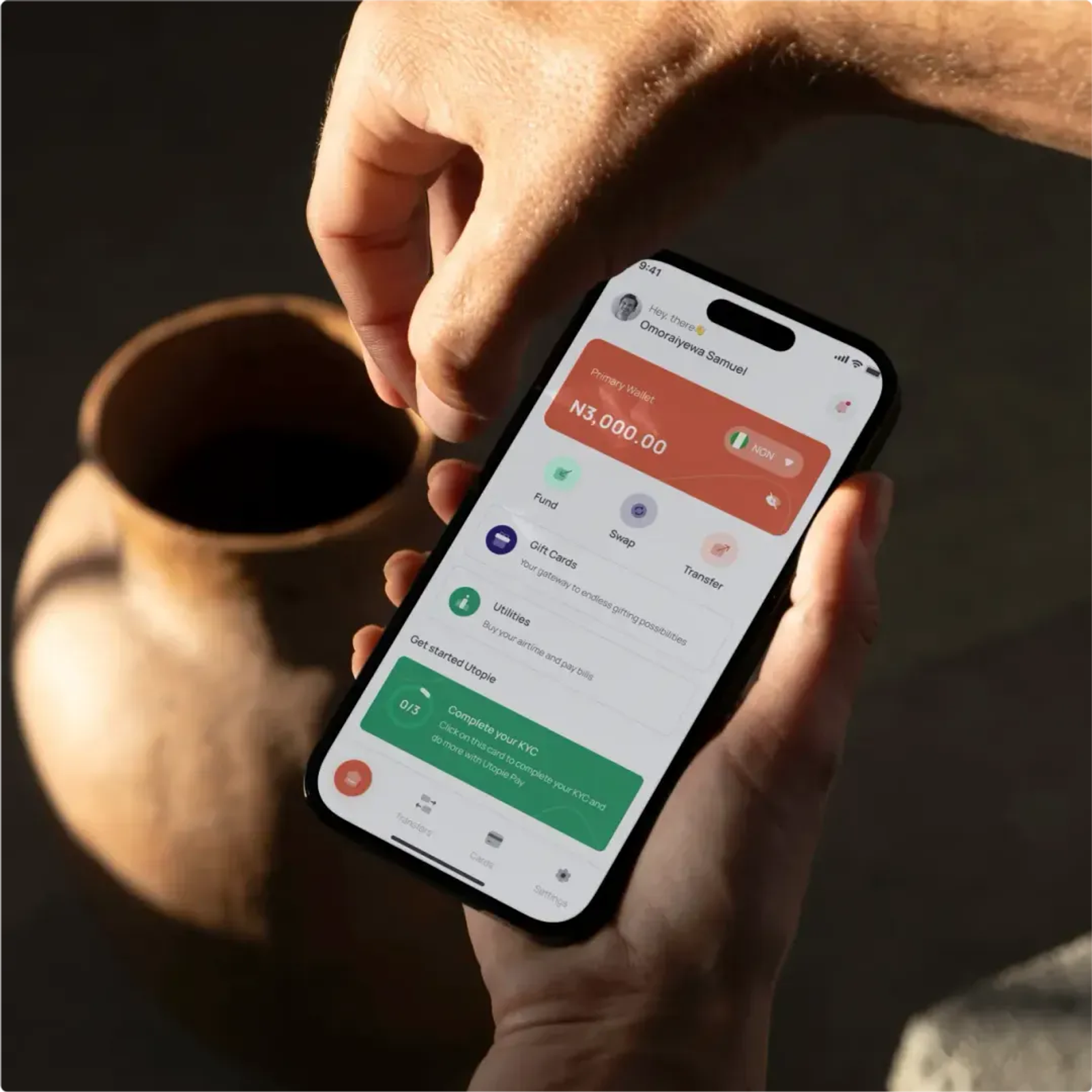
A wide cover image showing the mobile app and dashboard side by side.
The Problem
UtopiePay is a fintech platform that provides banking access to unbanked and underbanked people across Africa. Rather than running formal user research, this project grounded its approach in competitive analysis—reviewing existing fintech platforms to understand what worked, what didn't, and where UtopiePay could differentiate, particularly around one of the most common failure points in fintech onboarding: getting users through registration without losing them.
Design Decision: Deferring non-essential KYC to reduce onboarding drop-off
Full KYC verification typically requires several steps — personal details, government ID numbers, proof of address, a selfie for identity matching. Requiring all of it upfront is common in fintech apps, but after reviewing competitor platforms, the ones with lighter signup flows were consistently more satisfying to use, and the pattern held: longer onboarding meant more users abandoning before completing registration.
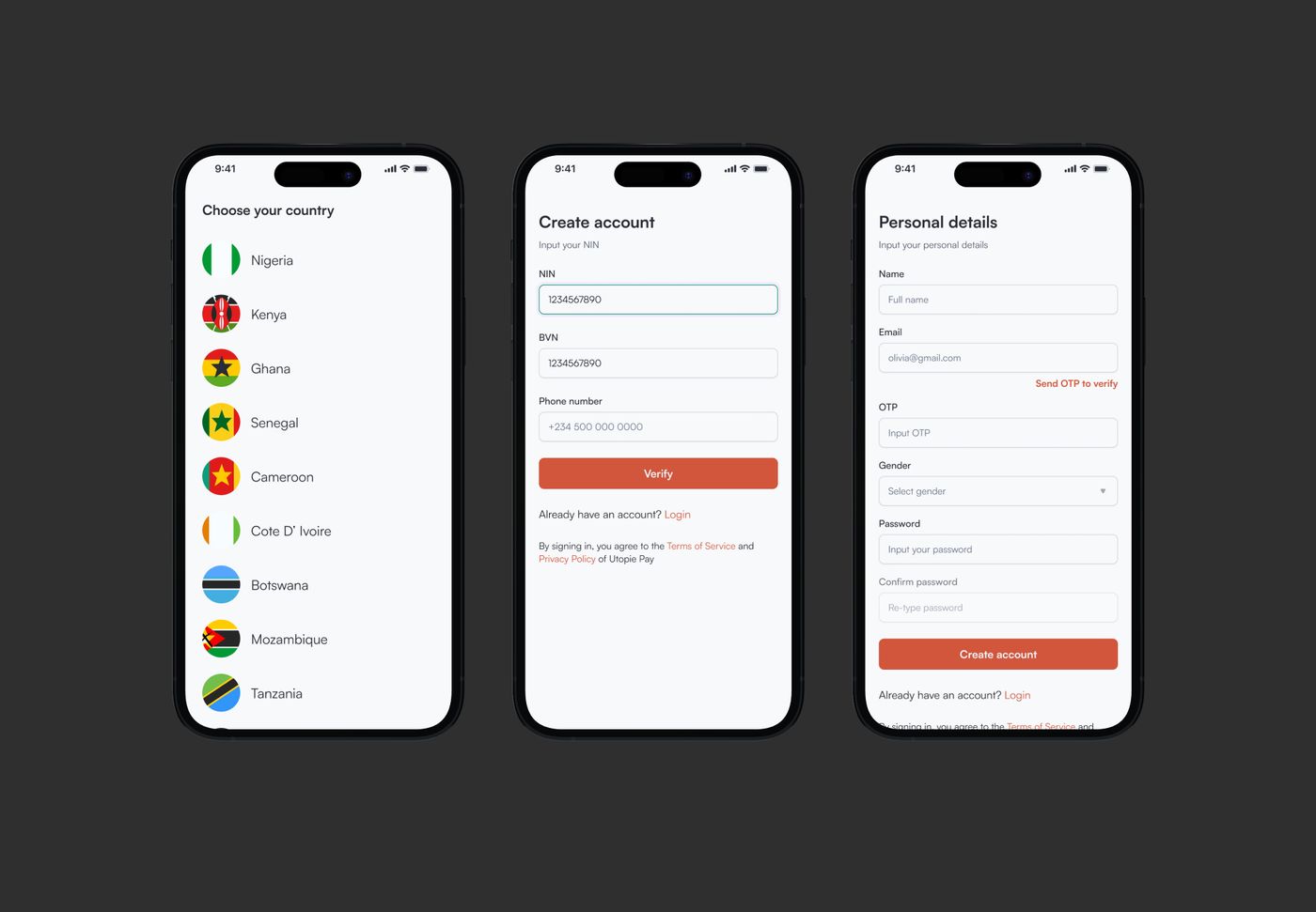
Registration was scoped to only what was legally required at that stage — NIN, BVN, and general personal details. Selfie verification and utility bill submission were deferred to later in the user journey, reducing the initial barrier to entry without compromising legal compliance. Users could get into the app and start experiencing the product before being asked for the more effortful verification steps.
The signup steps showing NIN/BVN/personal details, followed by where the deferred selfie/utility bill step appears later in the journey.
Design Decision: Mirroring patterns across user and business dashboards
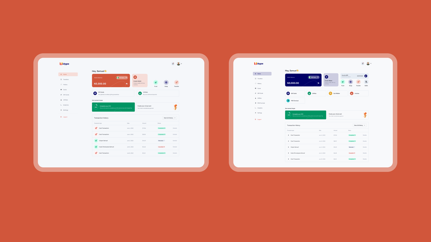
UtopiePay served both individual users and business accounts, with separate dashboards for each. Rather than designing distinct interaction patterns and components for the business side, the same design language and structure were carried across both — same components, same information architecture, different data. The goal was to avoid making anyone relearn the interface when using either side of the product.
Side by side, showing the shared visual/component language across both.
What Shipped
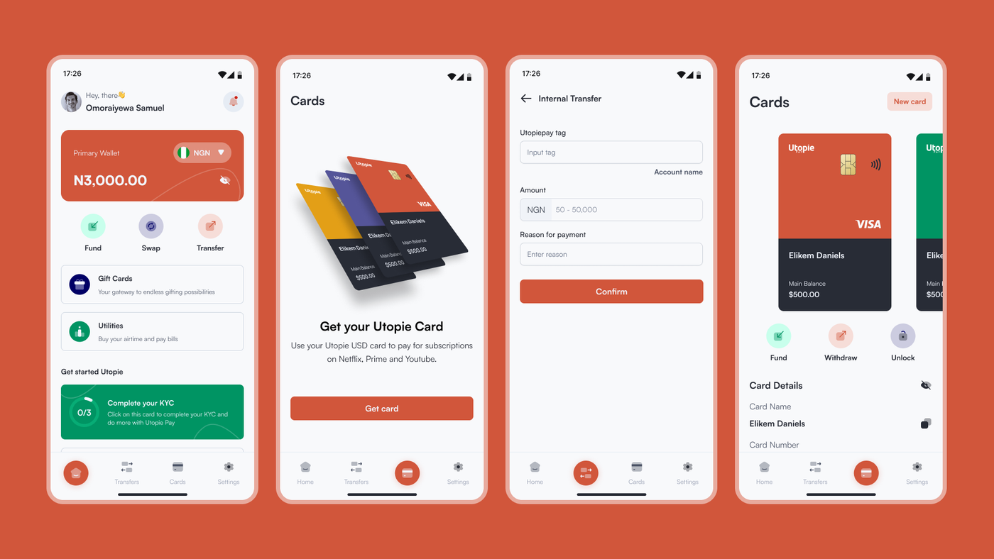
Mobile App — home, cards, utilities, and the full user-facing banking experience
Web Dashboard — user and business account management, mirrored in structure
Card service integration, giving users a functional banking card tied to the platform
A grid of key screens: mobile home, cards, utilities, and dashboard views.
Reflection
This project leaned more on competitive analysis than structured research, and the case study reflects that — the depth here is in the onboarding decision, not a broad research process. The strongest outcome was recognizing that KYC completeness and KYC placement are two different problems, and that deferring non-essential verification was a low-risk way to reduce drop-off without cutting corners on compliance.
If revisiting this today, the natural next step would be validating the actual drop-off numbers before and after the deferred-KYC change — that data wasn't tracked at the time, but it's the kind of decision that becomes much stronger with evidence behind it.